
Lagoon
Base style
Clear and roomy, for the tools that run a business.
- Business tools
- Booking
- Health
Free Style Pack
Lagoon is the free style · sent to your inbox · Full Design System $129
Works with Claude Code, Claude Design, Cursor, Lovable and v0, and with Figma in the Full Design System.
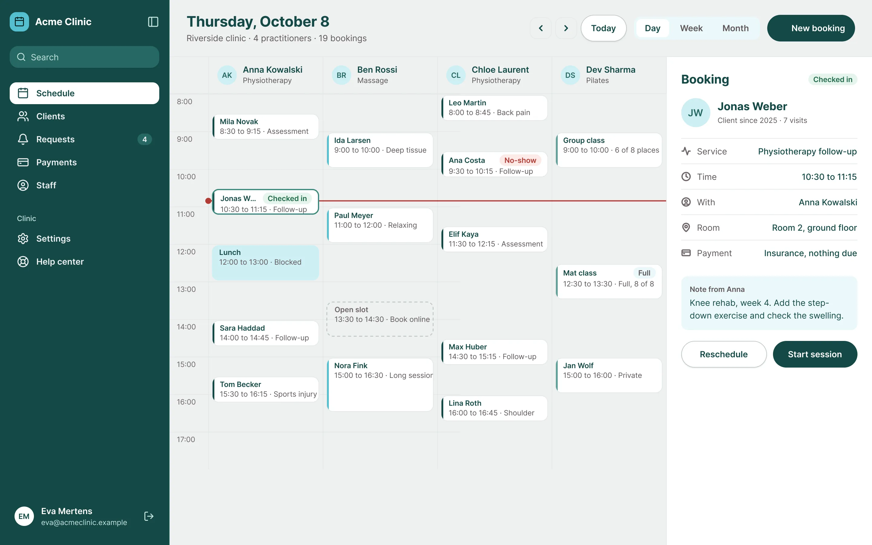
Acme Clinic is a demo brand, built with Lagoon from the same files you download.
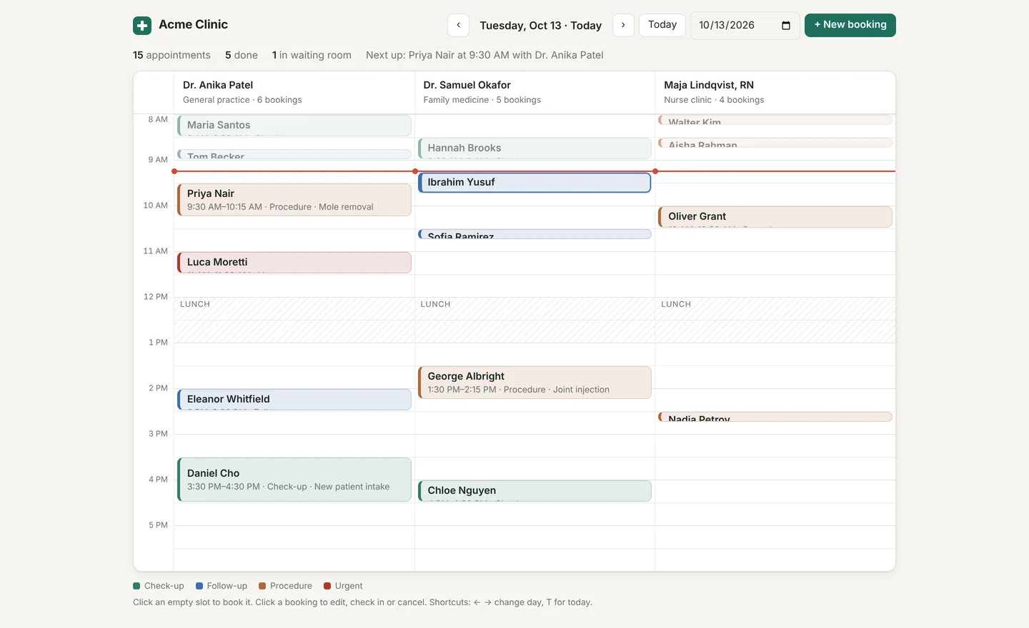
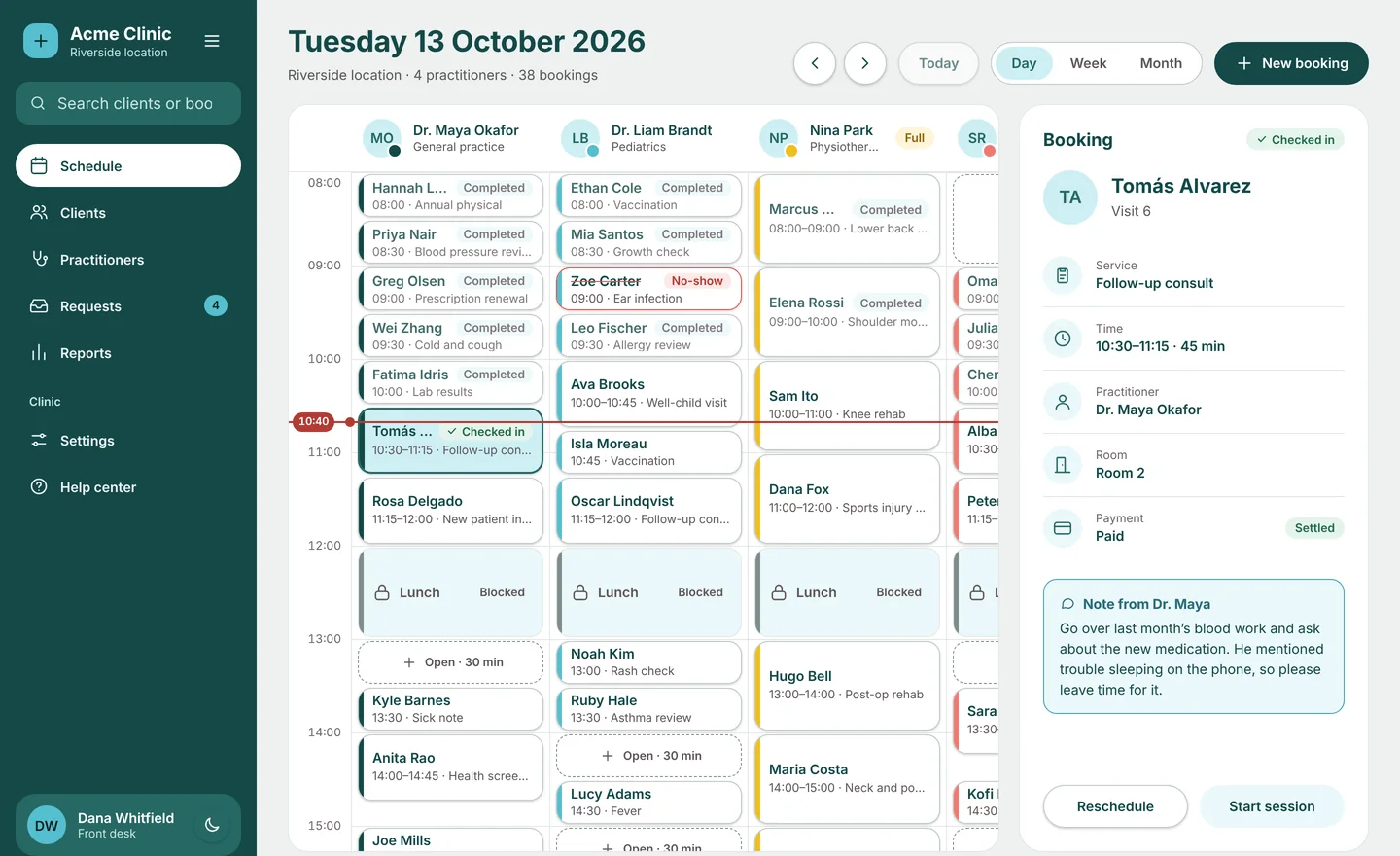
Same prompt, with and without Lagoon
Claude Code · one prompt · no edits
without a styledefault output
with LagoonLagoon 1.1.0 · skill, DESIGN.md, theme
Illustrations
The spot illustrations drawn to the Lagoon grammar, and six scenes for any industry, in light and dark. The illustration grammar ships with the pack as a Markdown file with an SVG starter, so new artwork from your agent stays in style.
18 spot illustrations · 6 scenes · light and dark
art · lightSVG
art · darkSVG
delivery · darkSVG
health · lightSVG
home · darkSVG
idea · lightSVG
learning · darkSVG
shop · lightSVG
Foundations
Everything Lagoon is built from, in one library. The same tokens drive the Figma file, the theme, DESIGN.md and the skill, so every screen your agent builds stays inside the system.
64
color tokens
30
text styles
58
dimension tokens
78
components
744
variants
35
page templates
25
illustrations in Figma
2
modes · light and dark
WCAG 2.2 AA contrast, checked before every release. Every text and background pair in Lagoon reaches 4.5:1 in light and dark mode, and focus rings, control borders and switch tracks reach 3:1. Every interactive component has its focus state drawn.
The system map
From the first token to whole pages, every level is designed and named the same way in Figma and in code.
Tokens
6 variable collections
- Color roles, light and dark
- Palettes · mist, lagoon, aqua, coral
- Status colors
- Text styles
- Spacing
- Radius
- Border width
- Shadows and glow
- Control and icon sizes
- Containers and grids
+ campaign roles for the skins
Base
15 pages in Figma
- Buttons
- Inputs
- Selection controls
- Sliders
- Badges and tags
- Avatars
- Tooltips
- Dropdown menus
- Progress and loading
- Featured icons
+5 more: dividers, kbd, rating, accordions, screen mockups
App UI
12 pages in Figma
- Navigation
- Page headers
- Tabs
- Pagination
- Tables
- Metric cards
- Charts
- Date pickers
- File upload
- Modals
+2 more: alerts and toasts, empty states
Marketing
13 pages in Figma
- Headers
- Banners
- Headings
- Hero sections
- Feature sections
- Logo clouds
- Metrics
- Pricing
- Testimonials
- FAQ
+3 more: CTA sections, newsletter, footers
Pages
5 pages · 2 showcases
- Auth
- Dashboards
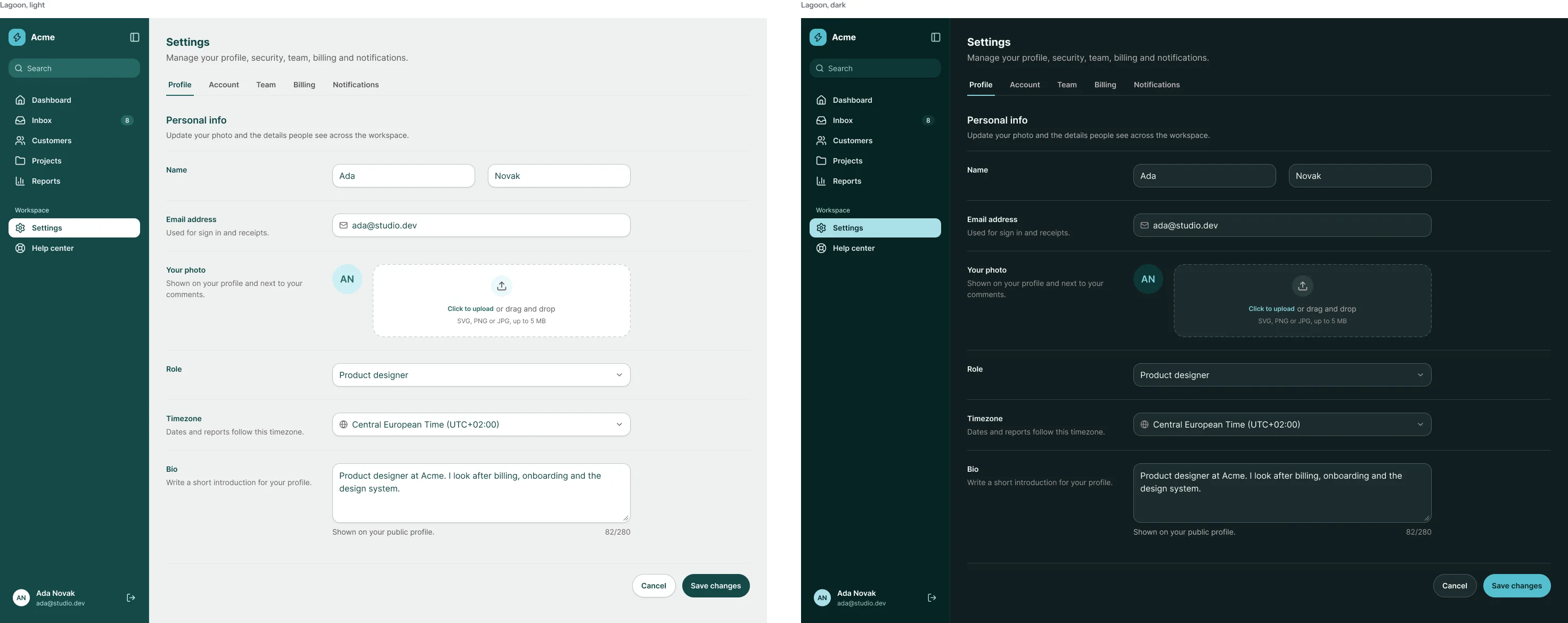
- Settings
- Onboarding and support
- Marketing pages
- Day schedule · Lagoon
- Mobile · Lagoon: my day, booking, new booking
One component, every state
Behind every name on the map sits a complete set like this one, in light and dark.
button · dark5 variants × 6 states
button · light5 variants × 6 states
states and types in the Figma components · light and dark
| component | states and types | variants and sizes |
|---|---|---|
| Button | Default, Hover, Pressed, Focus, Disabled, Loading | Primary, Secondary, Outline, Ghost, Destructive · SM, MD, LG |
| Icon button | Default, Hover, Pressed, Focus, Disabled, Loading | Primary, Secondary, Outline, Ghost · SM, MD, LG |
| Link | Default, Hover, Focus, Disabled | Brand, Neutral · SM, MD, LG |
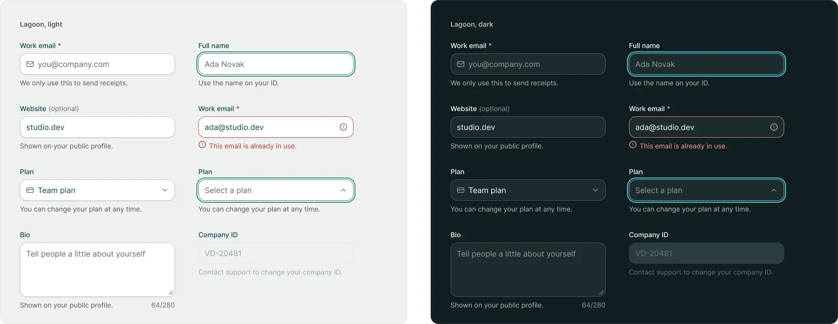
| Input | Default, Hover, Focus, Active, Filled, Error, Disabled, Read-only | SM, MD, LG |
| Textarea | Default, Hover, Focus, Active, Filled, Error, Disabled, Read-only | · |
| Select | Default, Hover, Focus, Open, Filled, Error, Disabled | SM, MD, LG |
| Checkbox | Default, Hover, Focus, Disabled | checked, unchecked, indeterminate · SM, MD |
| Radio | Default, Hover, Focus, Disabled | checked, unchecked · SM, MD |
| Toggle | Default, Hover, Focus, Disabled | on, off · SM, MD |
| Tab | Default, Hover, Active, Focus, Disabled | Underline, Pill |
| Toast | Default, Success, Error, Loading | · |
| Alert | Info, Success, Warning, Error, Neutral | · |
| Modal | Form, Confirm, Destructive | Desktop, Mobile |
| +65 more components |
Token library
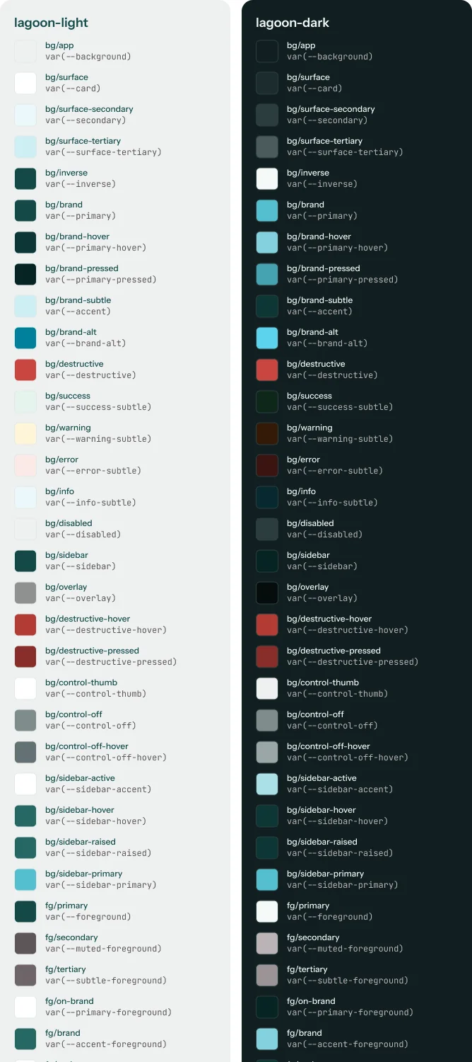
Every value in the system, grouped the way you look for it. Color roles carry a light and a dark value, and every token has a note on where it belongs.
mist25 to 950
lagoon25 to 950
aqua25 to 950
coral25 to 950
cyan25 to 950
gold25 to 950
ink25 to 950
jade25 to 950
12 of 64 color tokens shown here · all 64 come with the download
One token, every format
A token is written once and exported to every file your tools read, so a change in Figma reaches the code, DESIGN.md and the skill together.
Color / bg/brand
Dark   aqua/400
Light  lagoon/800
WEB    var(--primary)
"color": {
  "bg": {
    "brand": {
      "$type": "color",
      "$value":
"{palette.aqua.400}":root {
--primary:
oklch(0.371 0.054 193.26);
}
.dark {
--primary:
oklch(0.749 0.099 208.7);
}colors: primary: "#144948" primary-hover: "#0d3736" ## Colors Dark mode: ... primary #55BFCF.
<button className="
  bg-primary
  text-primary-foreground
  h-control-md px-4
  rounded-button
  text-label-md">
  Book a visit
</button>
Inside the Figma file
The Full Design System ships the library as a .fig file. Every picture here is rendered straight from that library, in Lagoon.
Choose your package
Compare every planone-time · free updates while we offer it · one license for you or your company
one-time · free updates while we offer it · one license for you or your company
Lagoon in your AI tool
Set it up once, then prompt the way you always do.
Step by step in the Claude Code guide.
Skins for Lagoon
Seasonal skins switch the campaign layer on and off. Your components stay as they are.
Questions about Lagoon
Does Lagoon work in dark mode?
Yes. Every token has a light and a dark value, and the preview above switches between them.
Can I change the colors?
Yes. Change bg/brand and the accents in the Figma library or in theme.css, and every component follows.
Is Acme Clinic a real product?
No. It is a demo brand, built with Lagoon from the same files you download.
Do I need to buy the fonts?
No. Inter is a Google Font under the SIL Open Font License, free for any project.
Which pages does the demo include?
On desktop, the day schedule; on a phone, three screens: my day, booking and new booking. Each comes in light and dark, all for Acme Clinic.
Related styles
All styles (16)
A design system built for your brand
Like Lagoon, made to measure: the Figma library, DESIGN.md, tokens and skills, so your team and your AI tools design on brand from the first screen.