
Billing & Subscriptions
UX Pack · works with every style
The plan, usage, payment method and invoices on one screen, with a download on every invoice.
Prices in USD. VAT is included where applicable in the EU and UK. In the US, Canada and India, applicable sales tax is added at checkout. Your final total appears before payment.
One screen on desktop and mobile
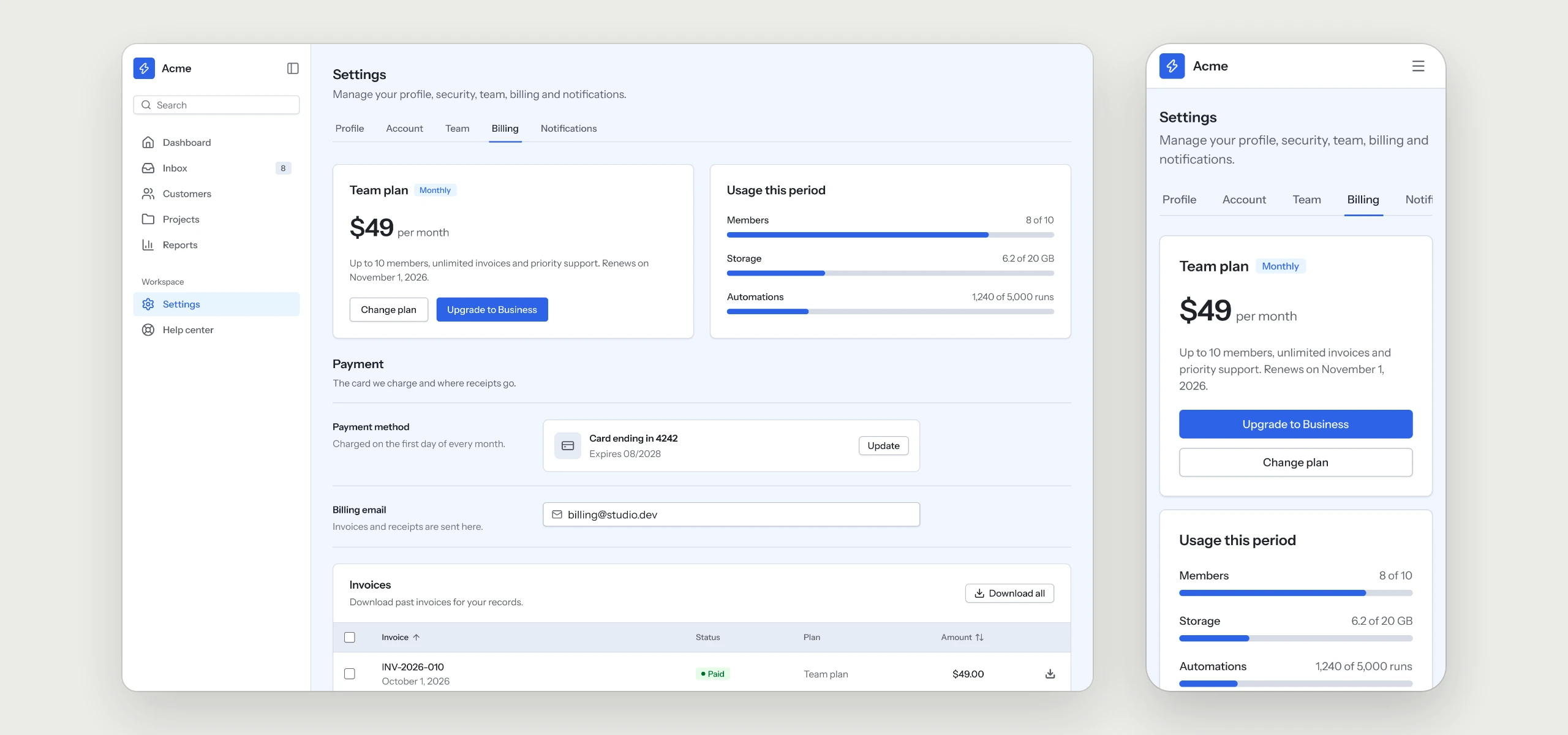
The current plan and usage side by side, the payment method and billing email, then past invoices in the Table component with a download action per row.
The rules your AI tool follows
Written into the skill, so every billing page your agent builds keeps them, in any style.
- 01Plan and usage side by sideThe current plan sits next to what has been used, so the next limit is never a surprise.
- 02Payment details under the planThe payment method and the billing email follow the plan, where people look for them.
- 03A download on every invoicePast invoices sit in a table with a download action on each row.
- 04Full-width buttons on mobileOn a phone the blocks stack in the same order and every button fills the width.
What is in the folder
Questions
Why does a UX Pack have no colors?
It describes how the flow works. The look comes from the style you already use, so it fits in without a second set of tokens.
Does it work with my payment provider?
The pack covers the screens and the rules behind them. Plans, charges and invoices stay with your payment provider and your code.
Which other UX Packs are there?
Sign-in & Sign-up, Onboarding, Dashboard, Settings & Account, Pricing & Paywall, Team & Permissions, Notifications, Search & Filters, Help Center & Errors and Checkout are ready today, with AI Chat and Forms & Validation on the way.
Works well with
A style gives the pack its look. A kit adds every other page of the product around this flow, and the two fit together.
picked to go with Billing & Subscriptions
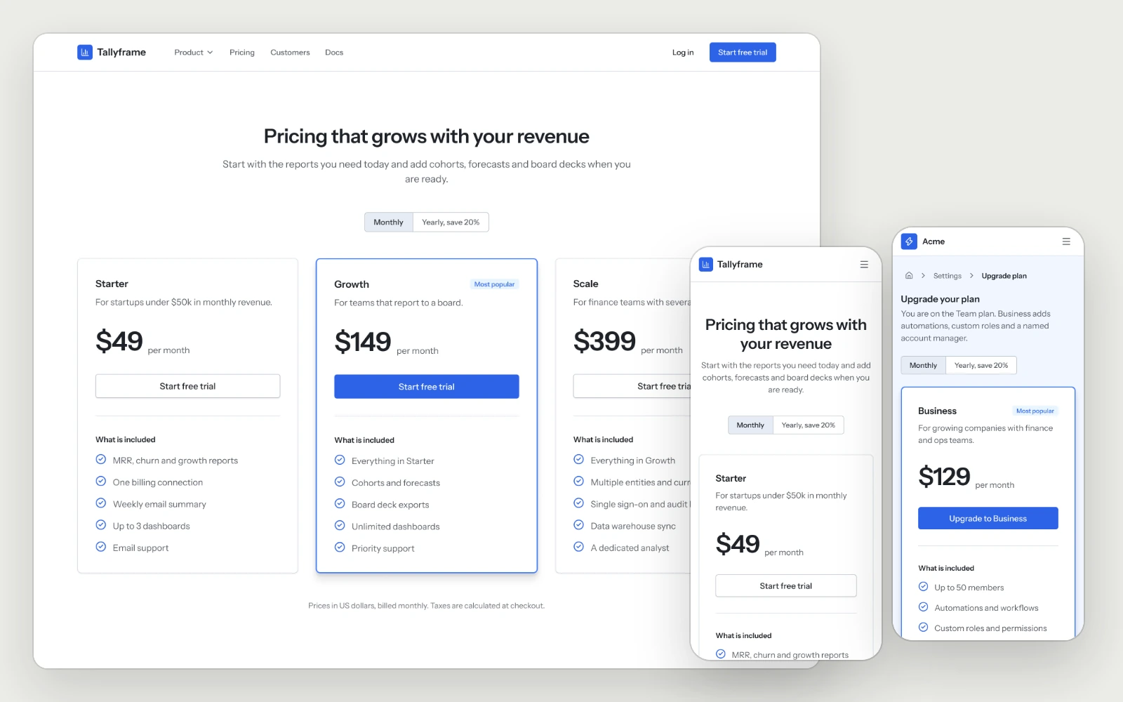
Pricing & Paywall
The pricing page with the full plan comparison, and the in-app upgrade with the current plan marked and the recommended one highlighted.
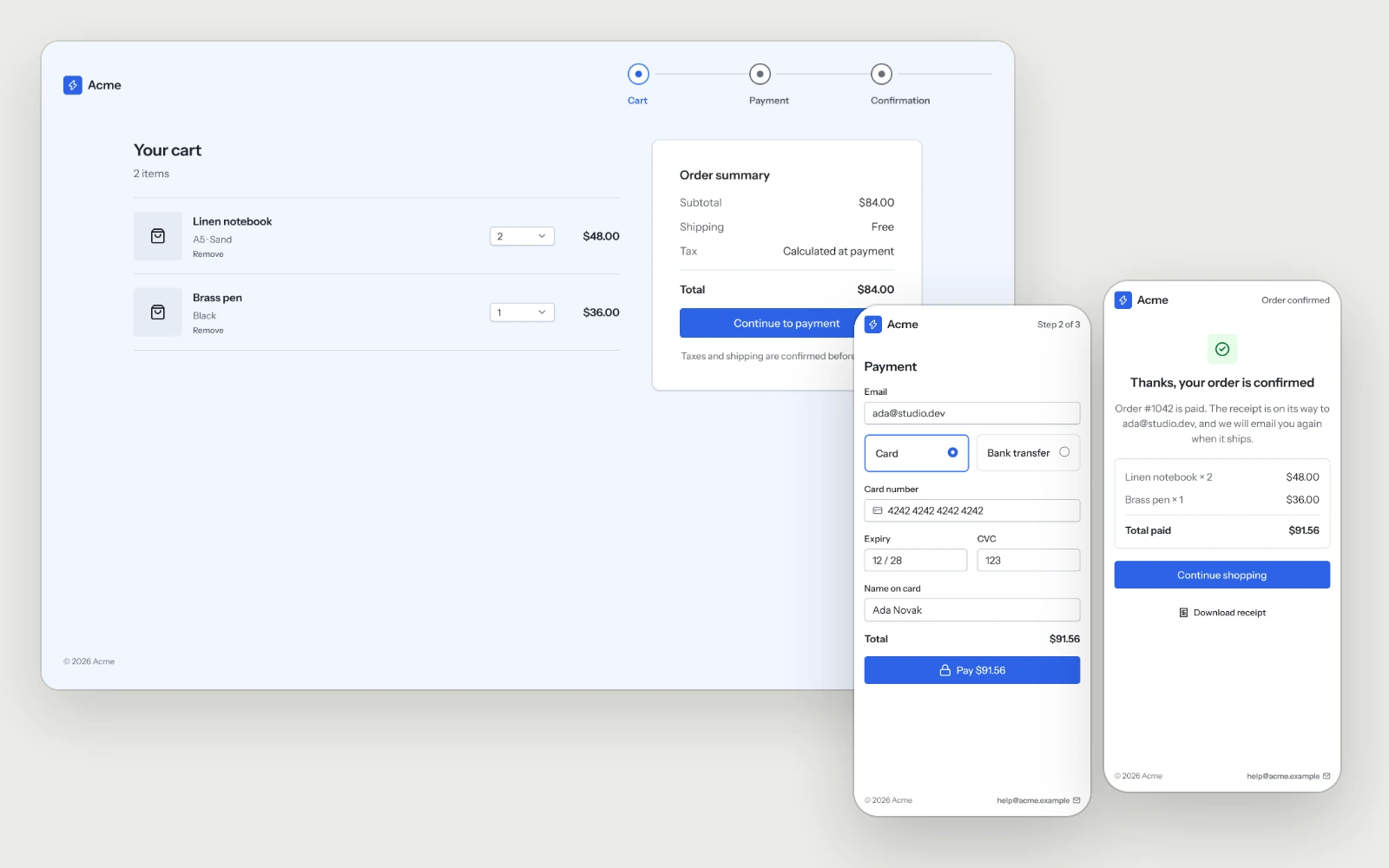
Checkout
The cart, payment in one view and the confirmation, with the total shown before the button and a declined card that keeps everything people typed.
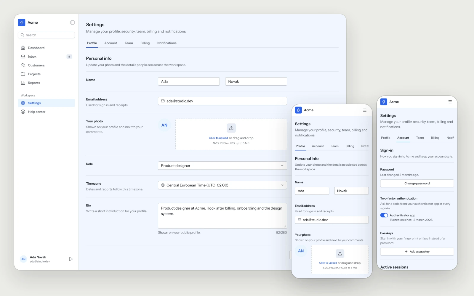
Settings & Account
Profile, sign-in methods, two-factor, sessions and account deletion, laid out so people find the setting they came for on the first try.