Settings & Account
UX Pack · works with every style
Profile, sign-in methods, two-factor, sessions and account deletion, laid out so people find the setting they came for on the first try.
Prices in USD. VAT is included where applicable in the EU and UK. In the US, Canada and India, applicable sales tax is added at checkout. Your final total appears before payment.
Click through the flow
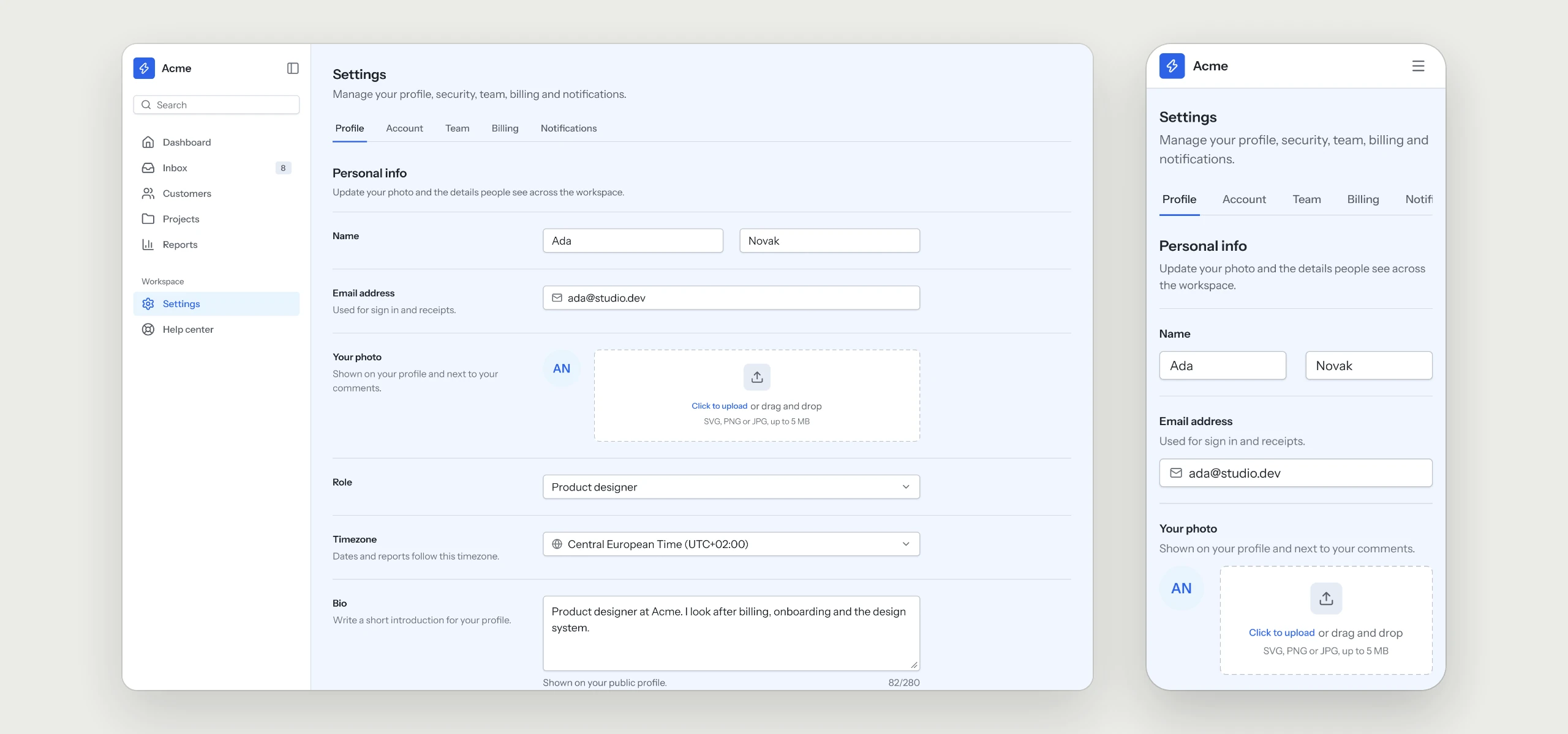
Profile settings for the Acme workspace. The page combines Page header with tabs, Section header, Input, Select, Textarea, File upload, Avatar and Toggle. Labels sit in a 280 px column with short hints, fields share one 560 px column, and a single footer saves the whole form.
The rules your AI tool follows
Written into the skill, so every settings page your agent builds keeps them, in any style.
- 01Labels in one column, fields in anotherLabels sit in a 280 px column with short hints, and every field shares one 560 px column.
- 02One footer saves the whole formPeople change what they came for and save once.
- 03Tabs under the page headerProfile and security are tabs of one settings page, so people keep their place.
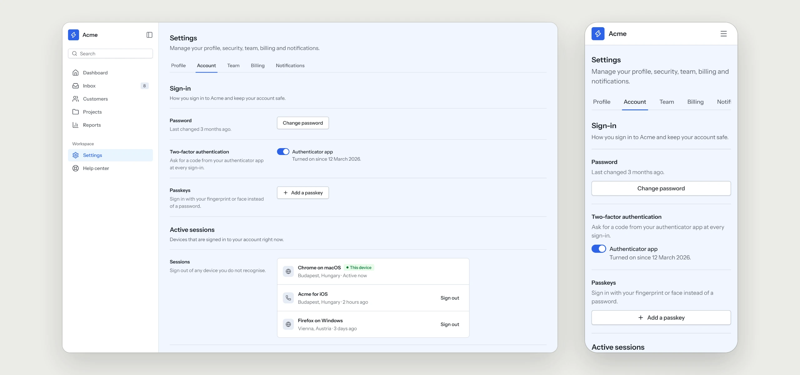
- 04Security in one placeSign-in methods, two-factor authentication and active sessions share one page.
- 05Destructive actions come lastAccount deletion sits in its own section at the end, behind a red button.
What is in the folder
Questions
Why does a UX Pack have no colors?
It describes how the flow works. The look comes from the style you already use, so it fits in without a second set of tokens.
Does it handle two-factor for me?
The pack covers the screens and the rules behind them. Two-factor and sessions themselves stay with your auth provider and your code.
Which other UX Packs are there?
Sign-in & Sign-up, Onboarding, Dashboard, Billing & Subscriptions, Pricing & Paywall, Team & Permissions, Notifications, Search & Filters, Help Center & Errors and Checkout are ready today, with AI Chat and Forms & Validation on the way.
Works well with
A style gives the pack its look. A kit adds every other page of the product around this flow, and the two fit together.
picked to go with Settings & Account
Sign-in & Sign-up
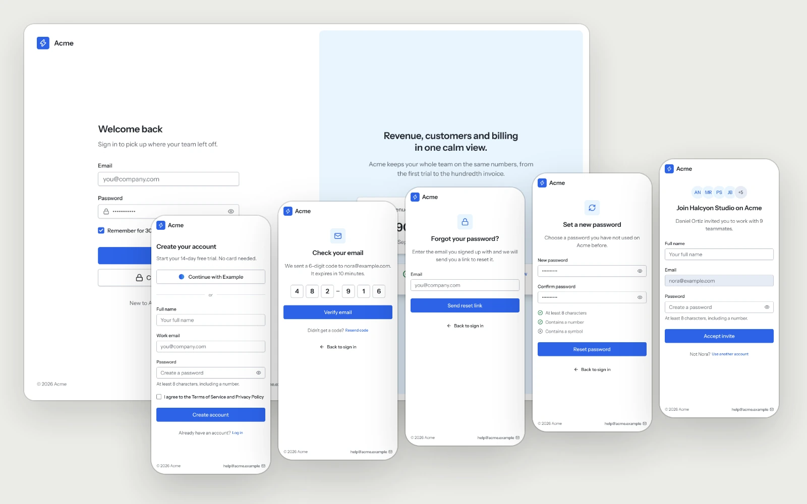
Sign in, sign up, the email code, password recovery and the invite page.
Team & Permissions
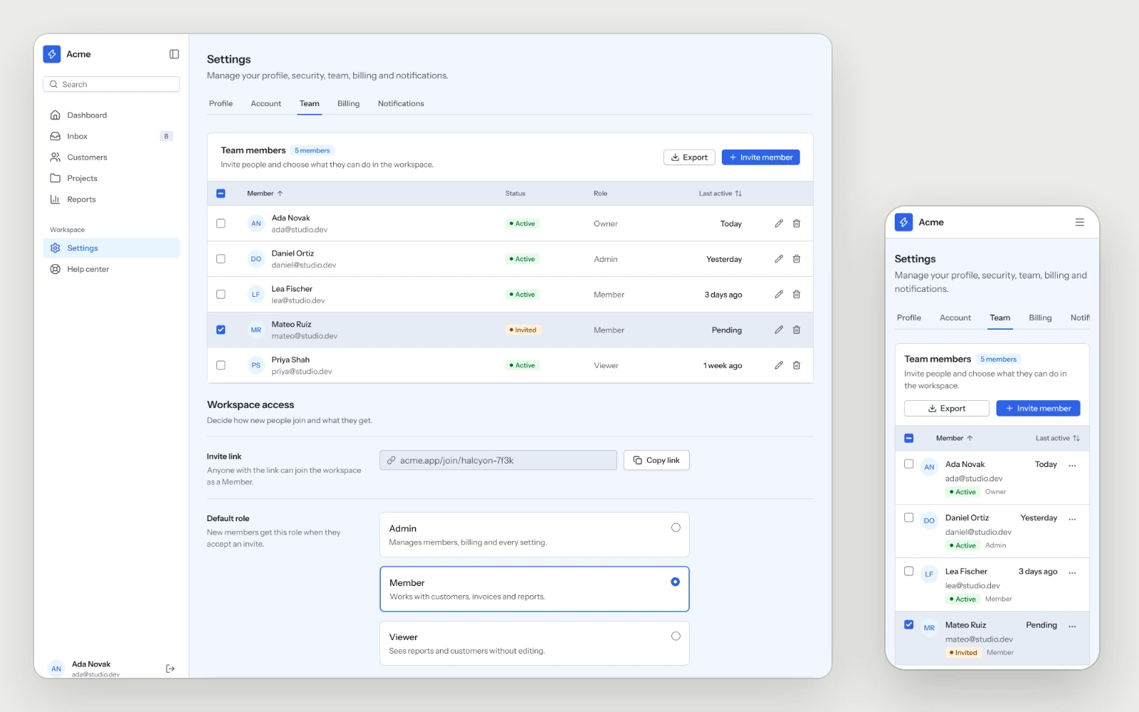
Members with their role, status and last activity, the invite link and the default role, so the second person on an account gets in without help.
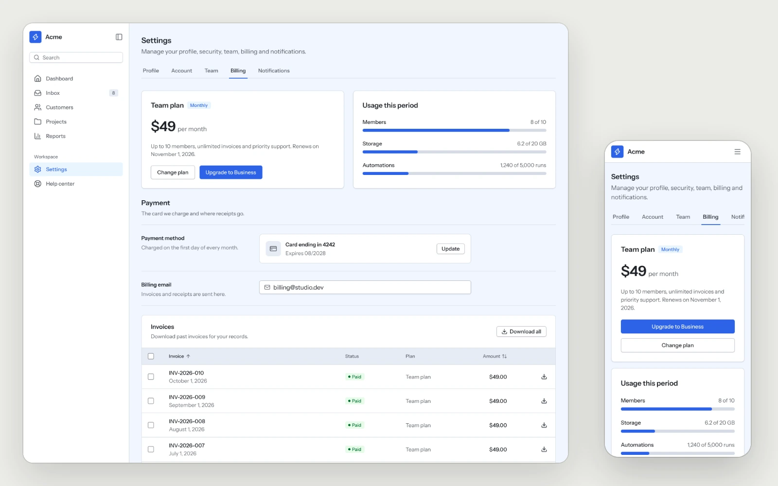
Billing & Subscriptions
The plan, usage, payment method and invoices on one screen, with a download on every invoice.