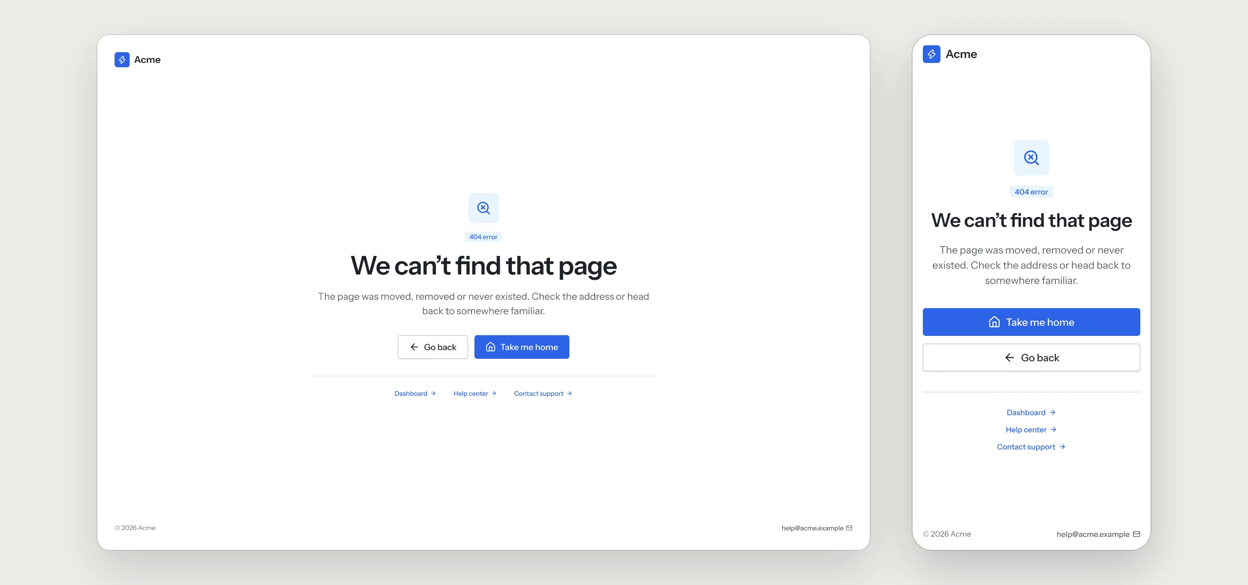
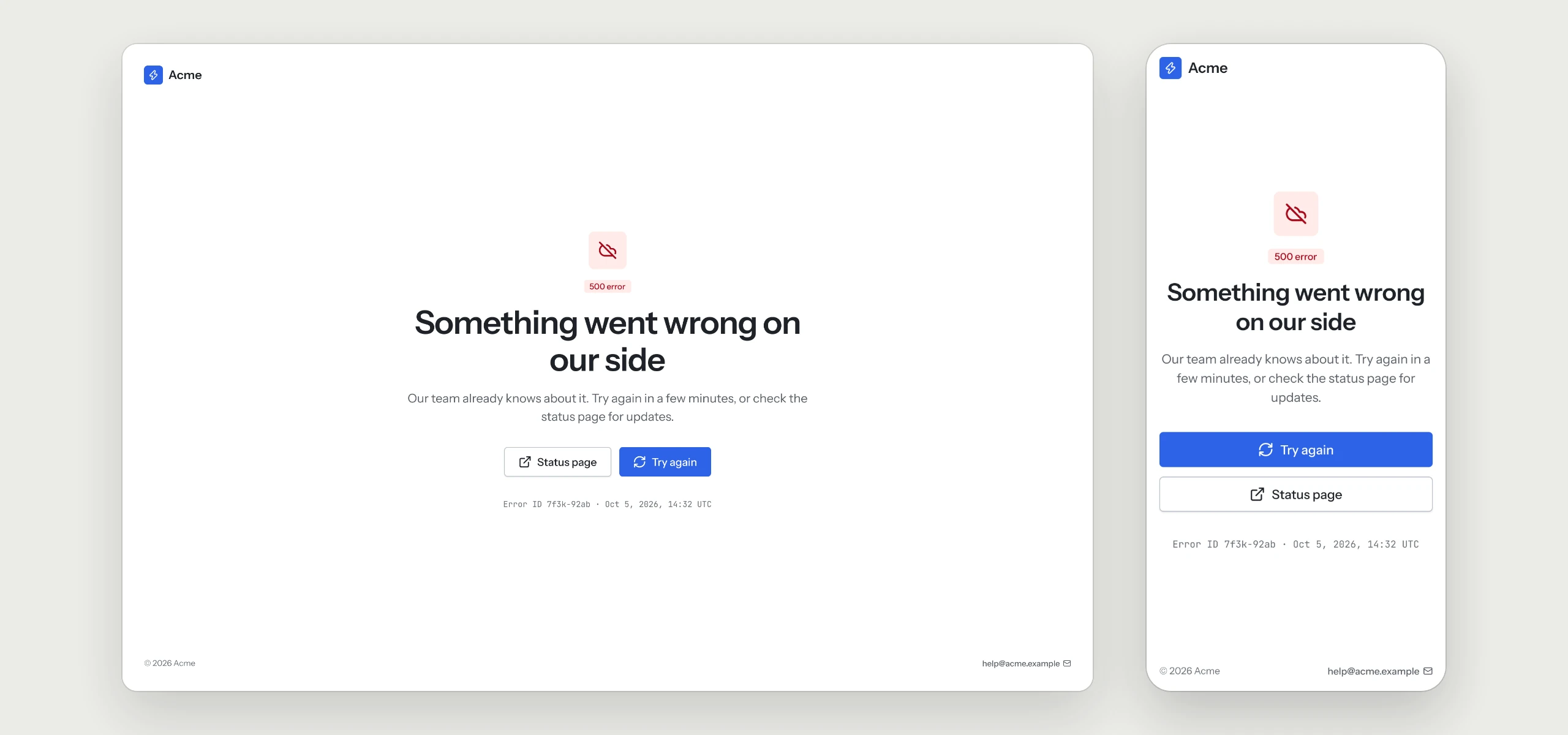
Help Center & Errors
UX Pack · works with every style
The help center and the 404 and 500 pages, each with a clear way back to work.
Prices in USD. VAT is included where applicable in the EU and UK. In the US, Canada and India, applicable sales tax is added at checkout. Your final total appears before payment.
Click through the flow
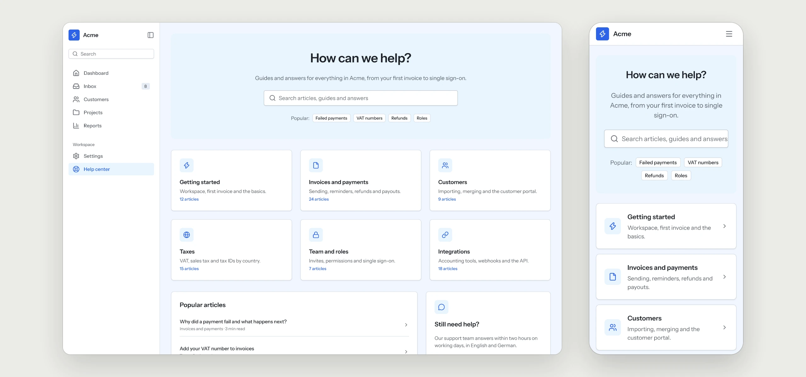
A help center inside the app: search first, then six categories, the most read articles and a way to reach a person. On mobile the categories turn into a list.
The rules your AI tool follows
Written into the skill, so every help center and error page your agent builds keeps them, in any style.
- 01Search comes firstThe help center opens on the search field, then the categories and the most read articles.
- 02A way to reach a personEvery help page ends with a contact option for what the articles do not answer.
- 03Two ways back from a broken linkThe 404 page offers two ways back and three common destinations.
- 04Errors in plain wordsThe 500 page says what happened, offers a retry and the status page.
- 05An error ID people can quoteSupport finds the problem faster when people can read the ID out.
What is in the folder
Questions
Why does a UX Pack have no colors?
It describes how the flow works. The look comes from the style you already use, so it fits in without a second set of tokens.
Does it come with help articles?
The pack covers the screens and the rules behind them. The articles and the status page stay with your own content and tools.
Which other UX Packs are there?
Sign-in & Sign-up, Onboarding, Dashboard, Settings & Account, Billing & Subscriptions, Pricing & Paywall, Team & Permissions, Notifications, Search & Filters and Checkout are ready today, with AI Chat and Forms & Validation on the way.
Works well with
A style gives the pack its look. A kit adds every other page of the product around this flow, and the two fit together.
picked to go with Help Center & Errors
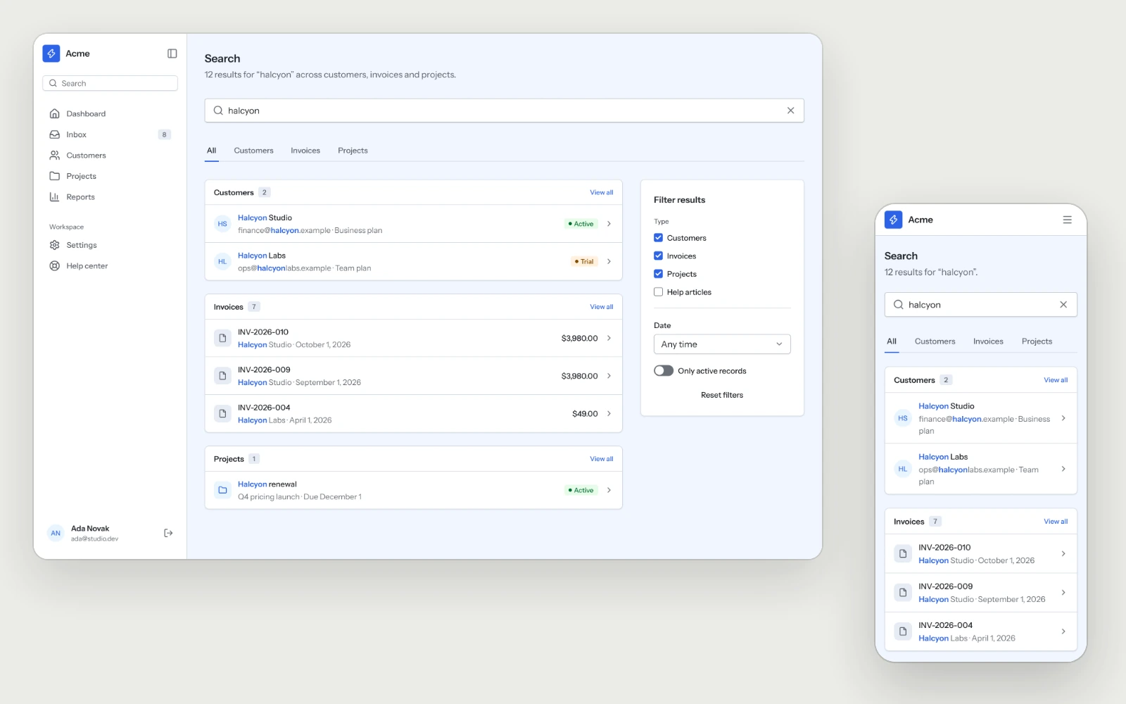
Search & Filters
Global search grouped by record type, with the matched term highlighted and a filter panel that moves behind one button on mobile.
Onboarding
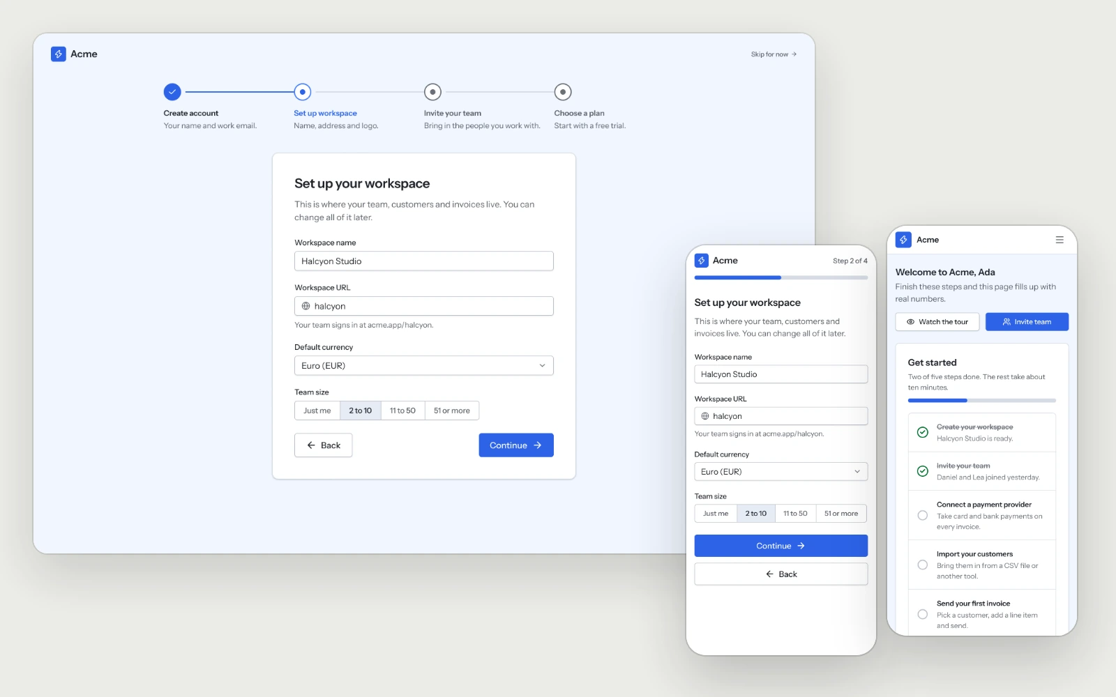
Four onboarding steps and a first login that turns the empty dashboard into a setup checklist, so new users reach their first result quickly.
AI SaaS Kit
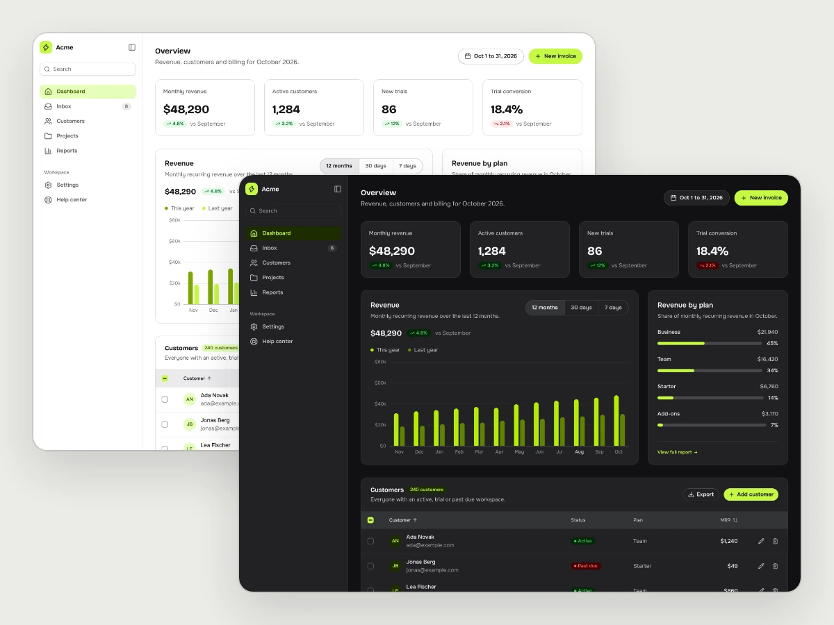
The pages and flows an AI product needs, in whichever style you choose.