
Search & Filters
UX Pack · works with every style
Global search grouped by record type, with the matched term highlighted and a filter panel that moves behind one button on mobile.
Prices in USD. VAT is included where applicable in the EU and UK. In the US, Canada and India, applicable sales tax is added at checkout. Your final total appears before payment.
One screen on desktop and mobile
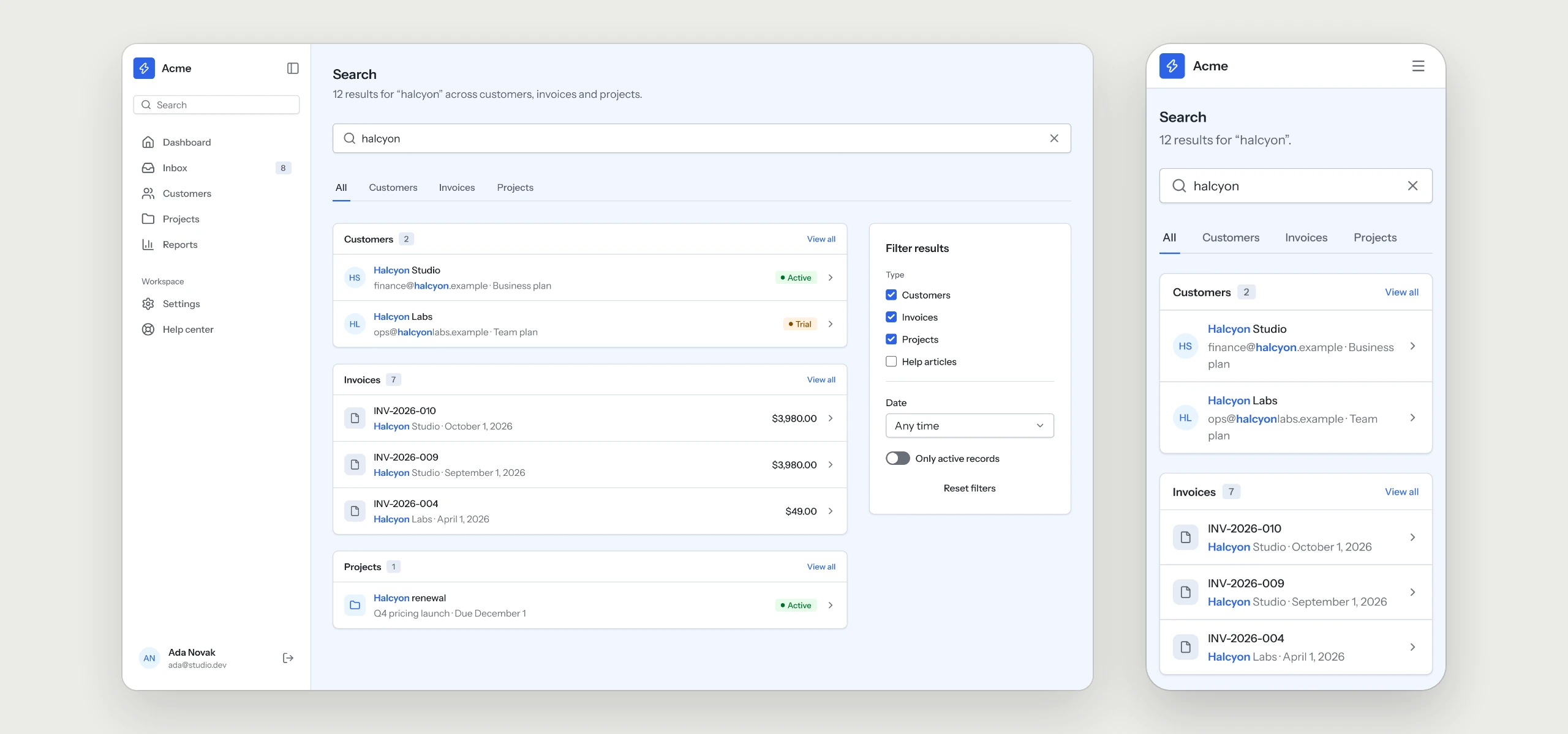
Global search results grouped by record type, with the matched term highlighted, a count per group and a filter panel. Each row opens the record; on mobile the filters move behind one button.
The rules your AI tool follows
Written into the skill, so every search page your agent builds keeps them, in any style.
- 01Results grouped by record typeEach group carries its own count, so people see where the matches are.
- 02The matched term is highlightedPeople see at a glance why a result showed up.
- 03A filter panel beside the resultsFilters narrow the list without leaving the page.
- 04Filters behind one button on mobileOn a phone the results come first and the filters open on request.
What is in the folder
Questions
Why does a UX Pack have no colors?
It describes how the flow works. The look comes from the style you already use, so it fits in without a second set of tokens.
Does it come with a search engine?
The pack covers the screens and the rules behind them. The search index and the queries stay with your backend and your code.
Which other UX Packs are there?
Sign-in & Sign-up, Onboarding, Dashboard, Settings & Account, Billing & Subscriptions, Pricing & Paywall, Team & Permissions, Notifications, Help Center & Errors and Checkout are ready today, with AI Chat and Forms & Validation on the way.
Works well with
A style gives the pack its look. A kit adds every other page of the product around this flow, and the two fit together.
picked to go with Search & Filters
Dashboard
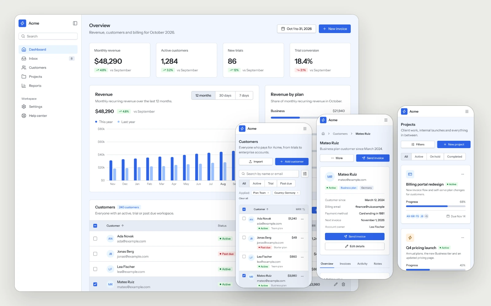
The overview, the customer list, a customer detail and the project board, built to stay readable as the data grows.
Help Center & Errors
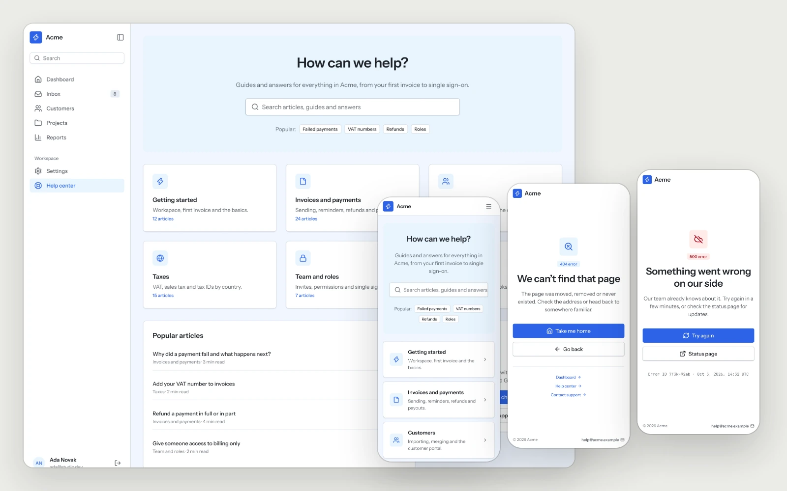
The help center and the 404 and 500 pages, each with a clear way back to work.
Business Tools Kit
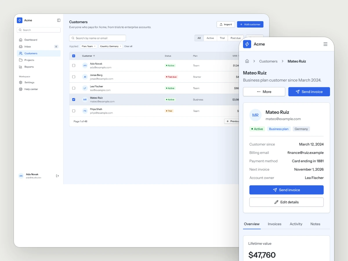
Dashboards, lists, detail views and settings for the tools that run a business.