Sign-in & Sign-up
UX Pack · works with every style
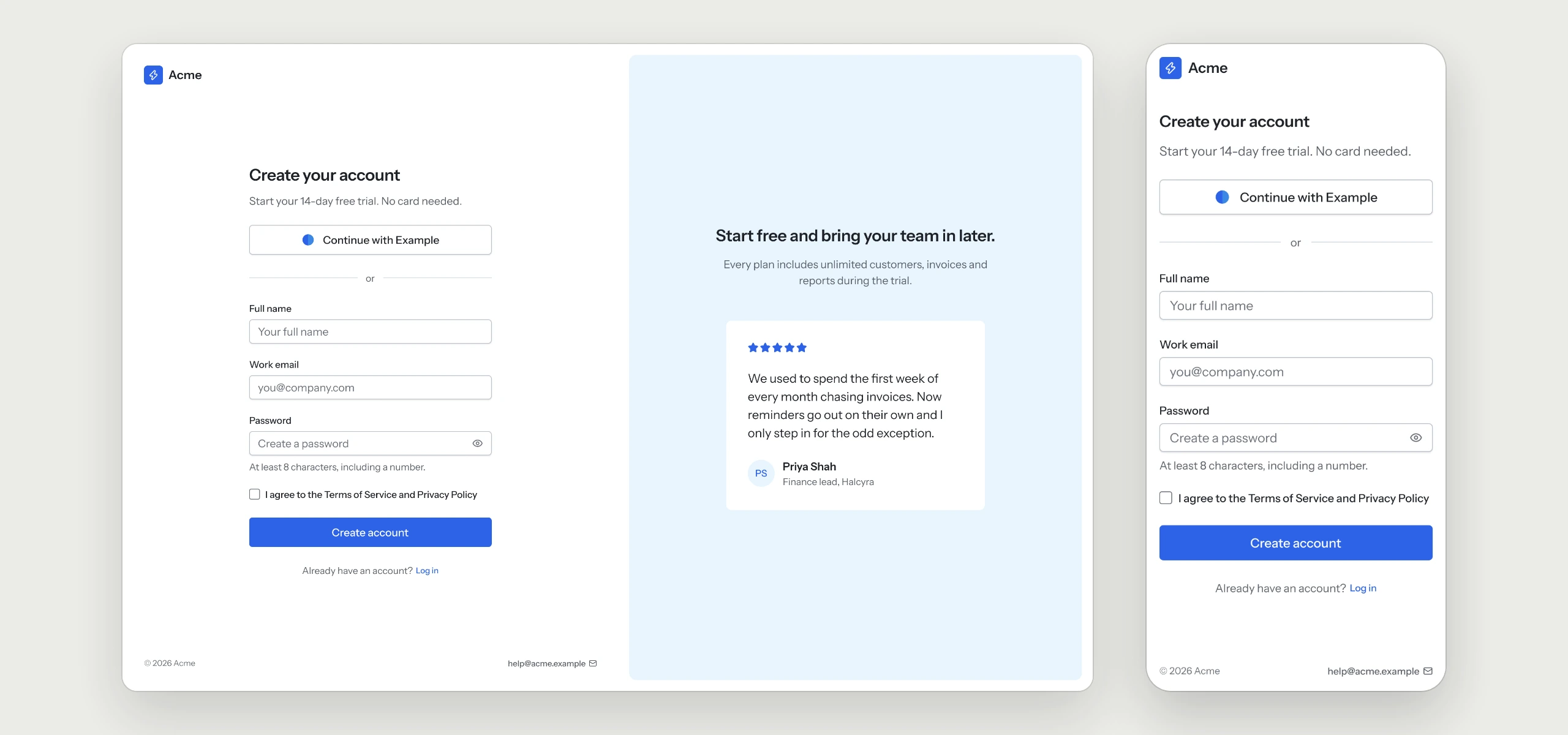
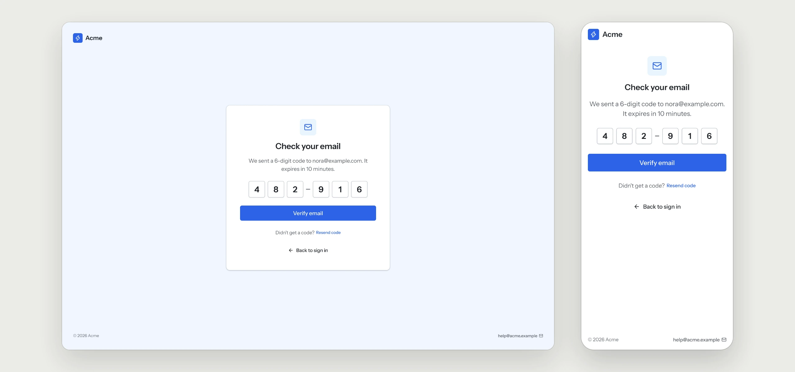
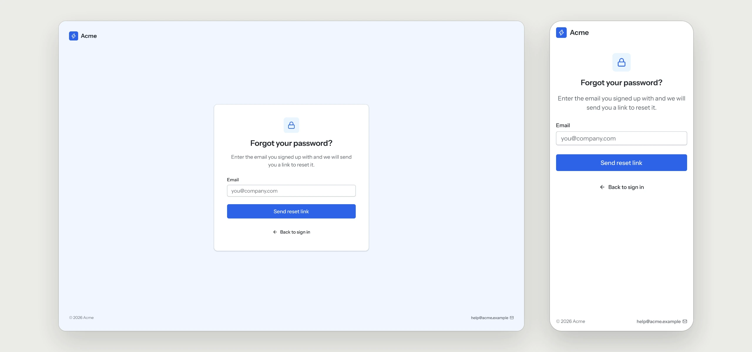
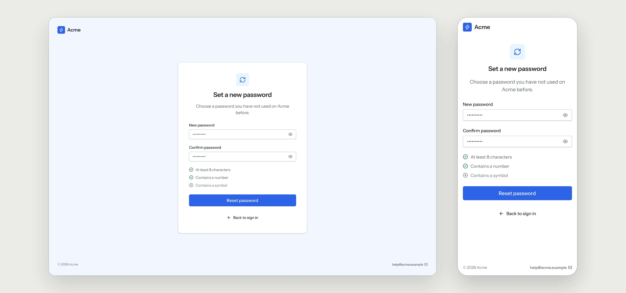
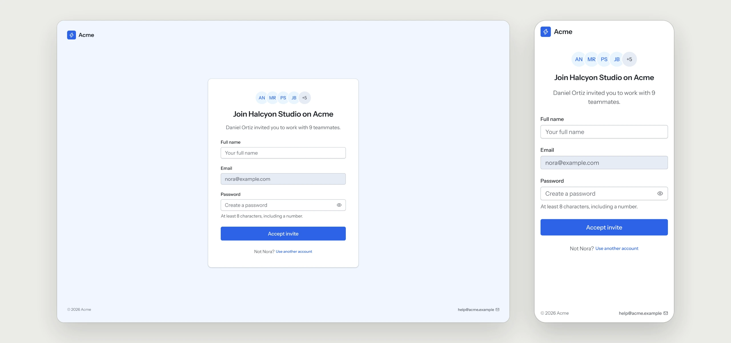
Sign in, sign up, the email code, password recovery and the invite page, each on desktop and mobile with the rule behind it.
Prices in USD. VAT is included where applicable in the EU and UK. In the US, Canada and India, applicable sales tax is added at checkout. Your final total appears before payment.
Click through the flow
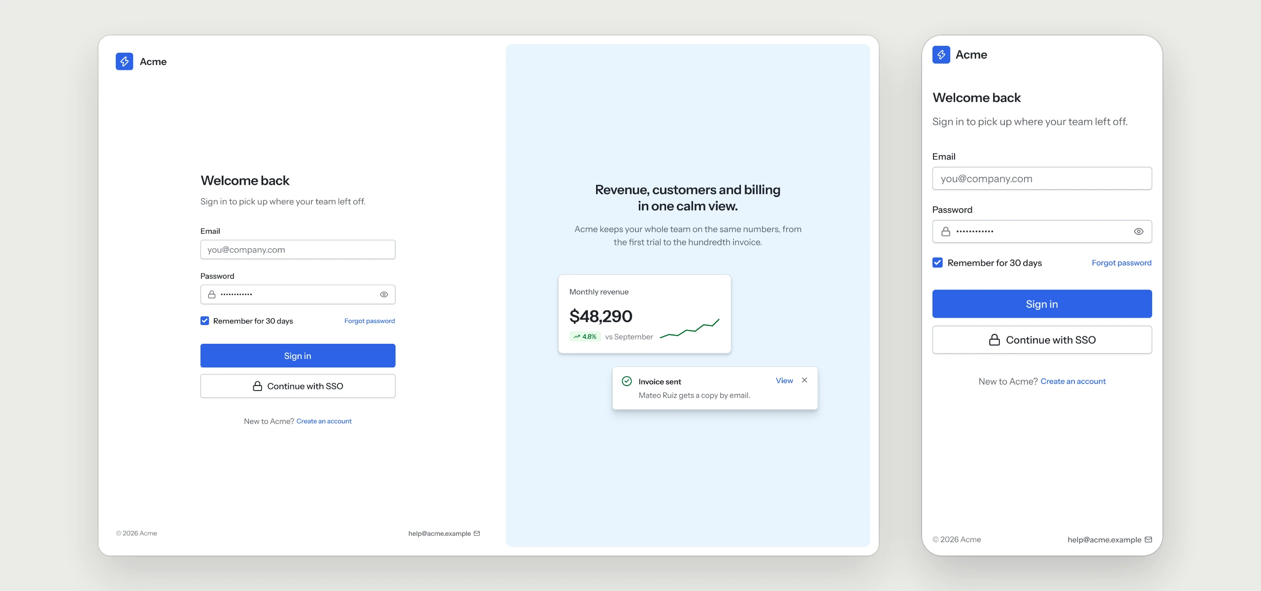
The sign-in page for the Acme workspace. The form column is 360 px wide and holds one primary action, with SSO as the outlined alternative. The preview side reuses Metric card and Toast on the brand subtle surface, so it changes with the style and theme.
The rules your AI tool follows
Written into the skill, so every sign-in flow your agent builds keeps them, in any style.
- 01One primary action per viewSSO and the social button sit beside it as outlined alternatives.
- 02Full-width buttons on mobileOn mobile the form stands alone and every button fills the width.
- 03The code input does the typingFocus moves on by itself, a pasted code fills every box, and resend waits 30 seconds after each send.
- 04Always a way backRecovery pages hold one field, one action and a link back to sign in.
- 05Password rules update as people typeThe rule people still miss is visible before they press the button.
- 06Invites name the workspace and the inviterThe email comes from the invite and stays read-only.
What is in the folder
Questions
Why does a UX Pack have no colors?
It describes how the flow works. The look comes from the style you already use, so it fits in without a second set of tokens.
Does it work with my auth provider?
The pack covers the screens and the rules behind them. Connecting sign-in itself stays with your auth provider and your code.
Which other UX Packs are there?
Onboarding, Dashboard, Settings & Account, Billing & Subscriptions, Pricing & Paywall, Team & Permissions, Notifications, Search & Filters, Help Center & Errors and Checkout are ready today, with AI Chat and Forms & Validation on the way.
Works well with
A style gives the pack its look. A kit adds every other page of the product around this flow, and the two fit together.
picked to go with Sign-in & Sign-up
Settings & Account
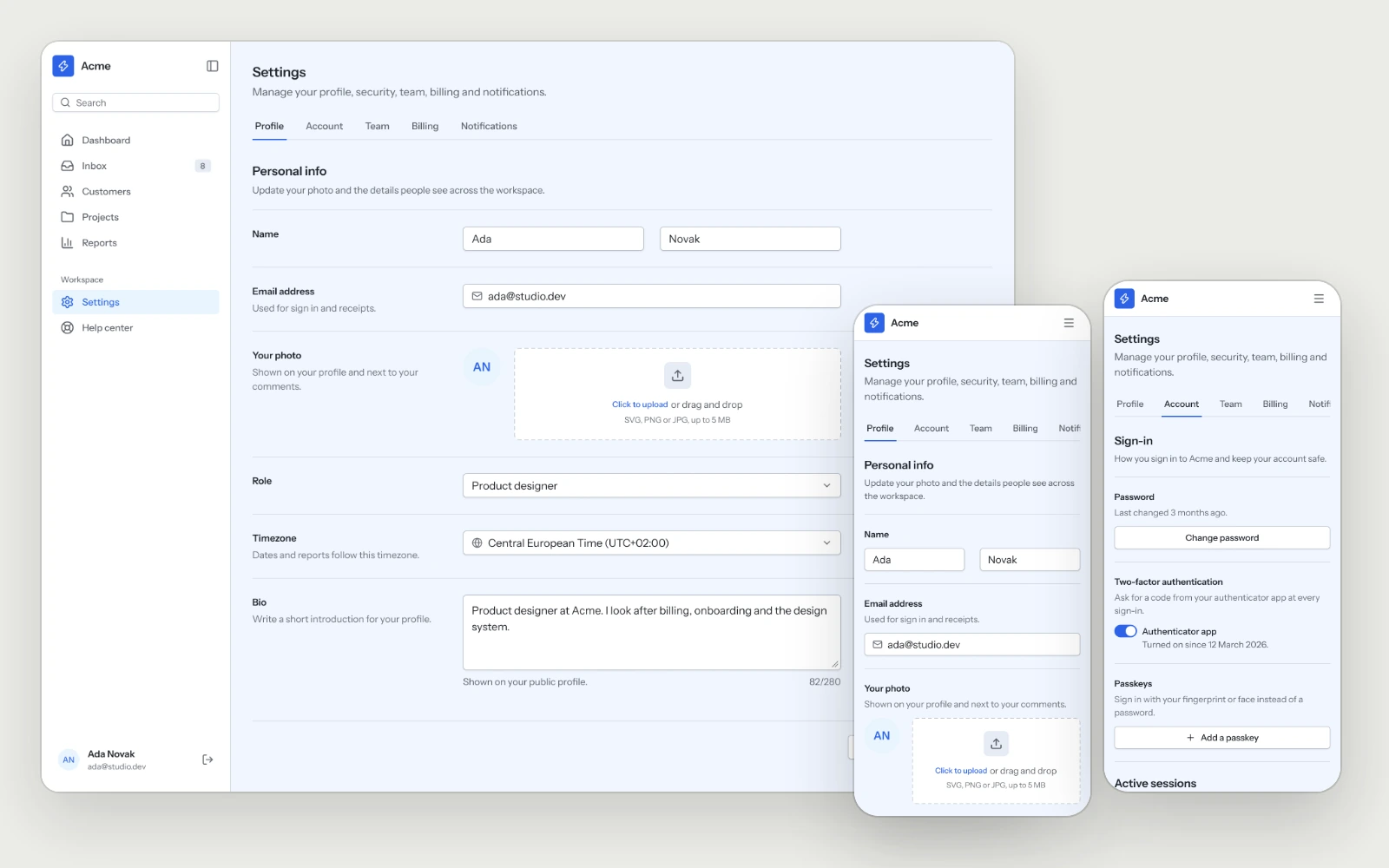
Profile, sign-in methods, two-factor, sessions and account deletion, laid out so people find the setting they came for on the first try.
Onboarding
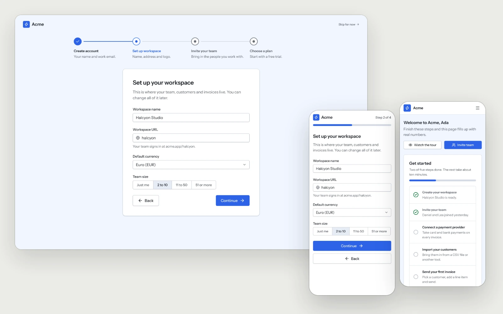
Four onboarding steps and a first login that turns the empty dashboard into a setup checklist, so new users reach their first result quickly.
AI SaaS Kit
The pages and flows an AI product needs, in whichever style you choose.